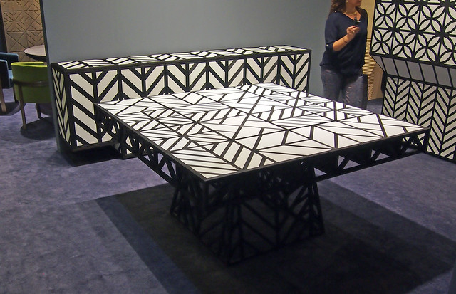
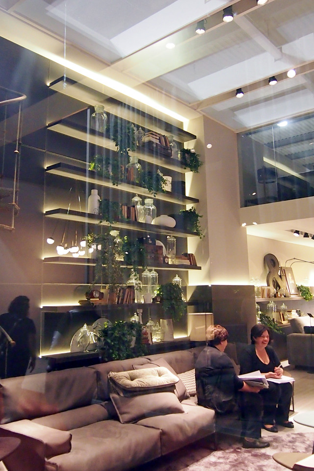
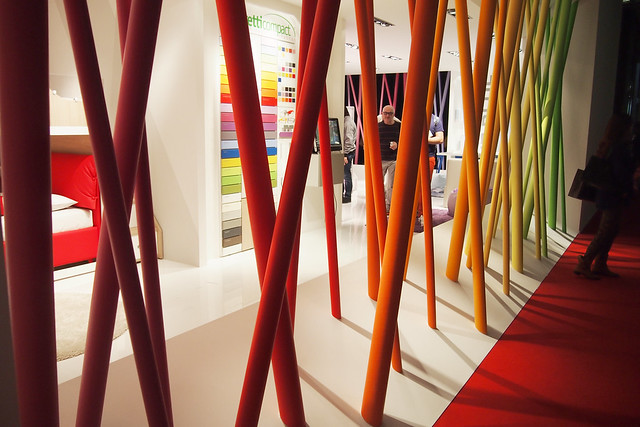
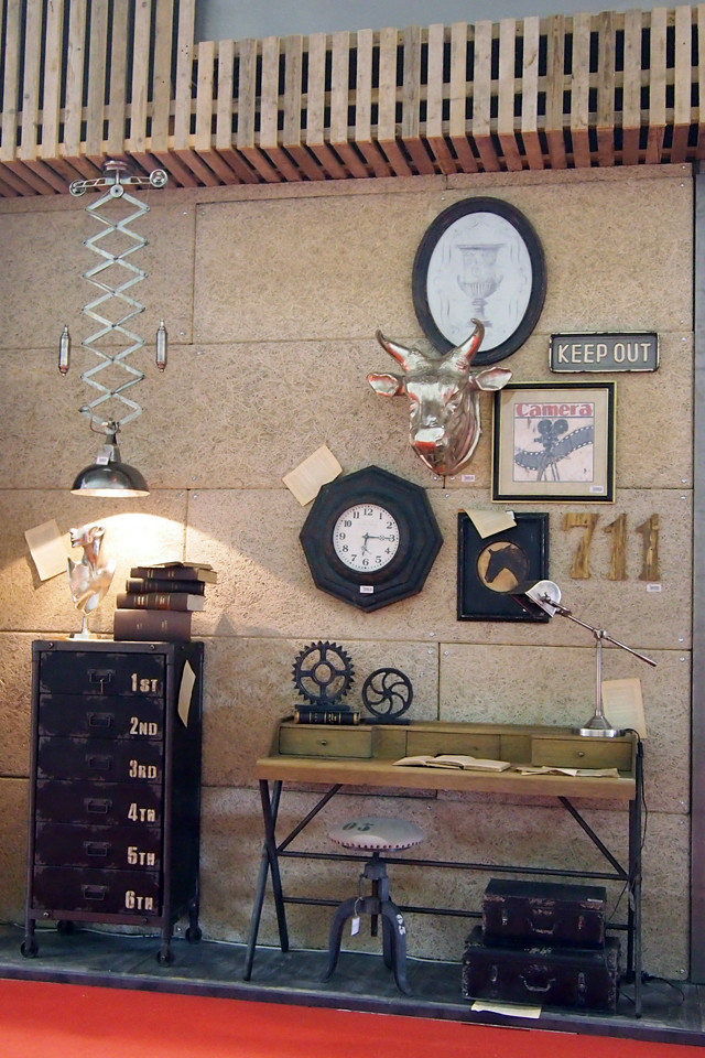
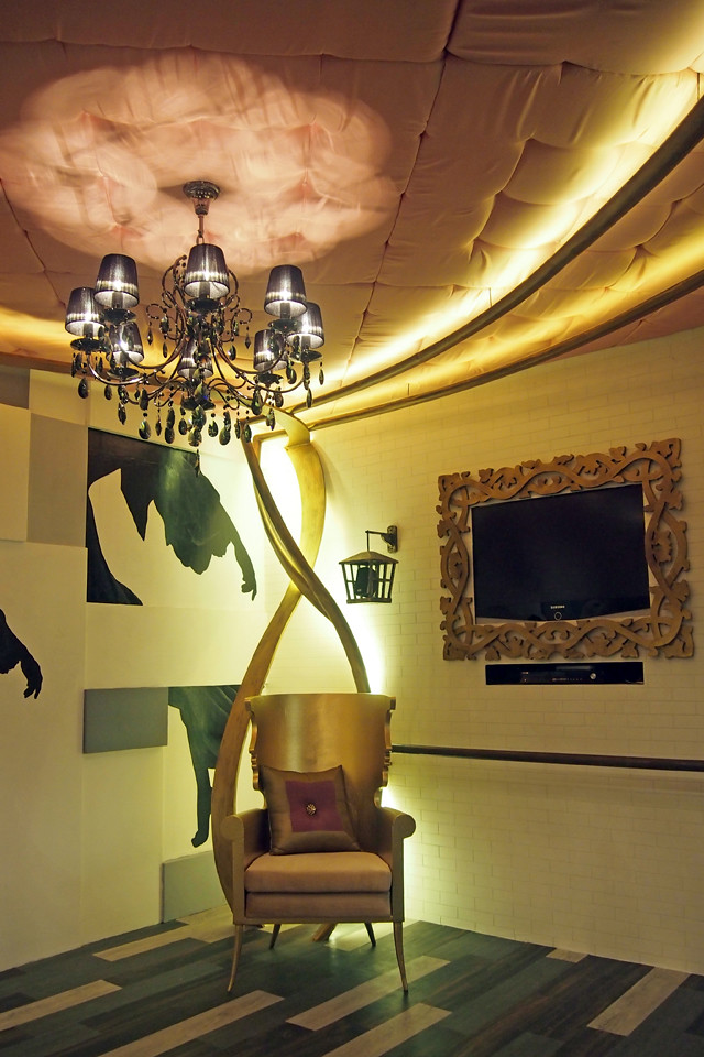
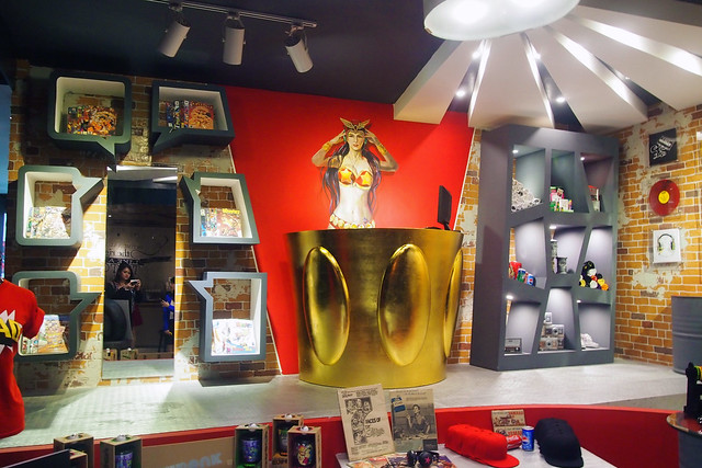
Kundiman, opera, tribal, zarzuela, novelty, Pinoy pop – the Philippines has a rich musical history showcasing various genres and styles. This is the highlight of “OPM: Obra Para sa Musika” the graduation exhibit of the Philippine School of Interior Design (PSID) Advanced Class of 2013.
Marking the 46th anniversary of PSID, and co-presented by Glorietta mall, Organisasyon ng Pilipinong Mangaawit (OPM), and the Filipino Society of Composers, Authors and Publishers (FILSCAP), this year’s exhibit aims to marry the interrelated fields of design and music by translating popular Filipino songs into aesthetically and functionally designed interior spaces.
The students were challenged to embody the tone and mood of their group’s assigned song and Filipino music in general and incorporate these into livable interior spaces. They researched not just on the basic design principles and ergonomics, but also on the background and story behind each song -- the characters, melodies, lyrics, composers and artists, and music genre.
Songs from different genres, traditional to modern, were used as inspiration for the different booths in the exhibit to showcase not just different design aesthetics but the richness and diversity of Filipino music. After visiting the exhibit, the audience is expected to have a renewed sense of appreciation for the beauty and exquisite musical heritage of our country as translated into the designs.
Slated on October 1-31, at the 3rd level of Glorietta 3, Ayala Center, Makati City, the exhibit showcases over 20 exquisitely designed spaces inspired by timeless Original Pilipino Music pieces.
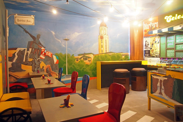
MAMANG SORBETERO - Celeste Legaspi (ice cream shop)


This group had a
dirty ice cream cart and gave away free ice cream during press day! So cool!
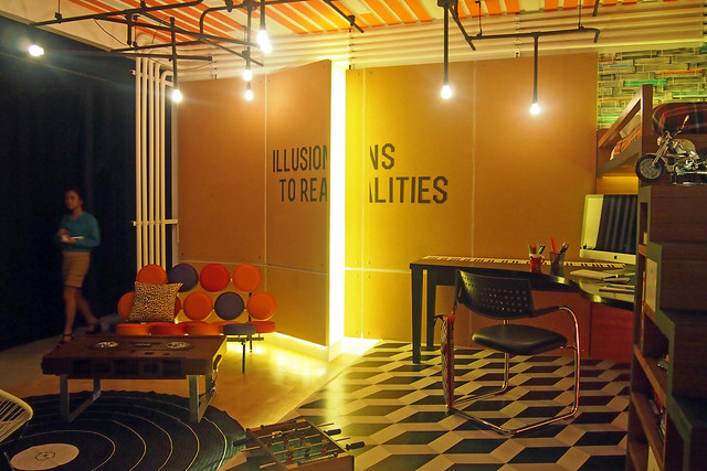
GROWING UP - Gary V. (teenager's room)


See the wall beside the bed? Those are actually stacks of magazines bound together and used as a soundproofing element for this space. Perfect for teens wanting to be in a band- they can rehearse with the band here. The grand piano study desk is also really cool! My sister would love this room.
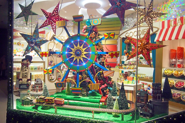
KUMUKUTIKUTITAP - Ryan Cayabyab (candy store)


I felt like I was transported to Disneyland! This group took inspiration from a holiday store display in New York. Cute!
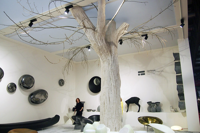
KANLUNGAN- Noel Cabangon (sitting area)


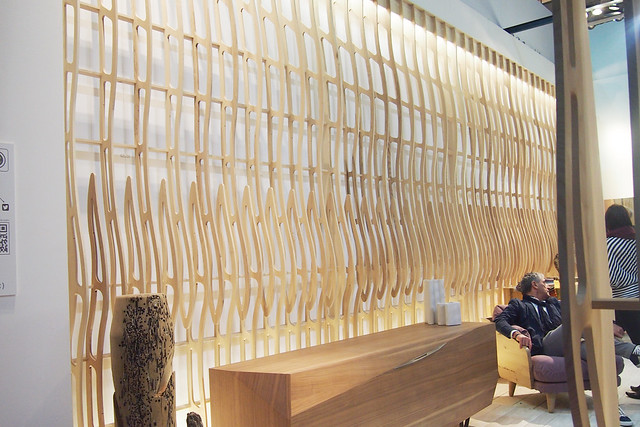
Really liking the faint tree branches painted on the ceiling and those backlit panels
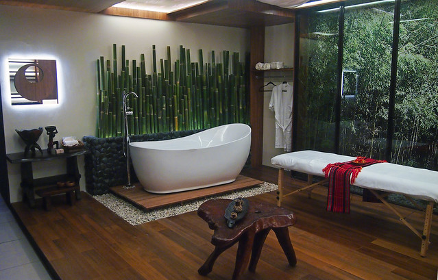
NOYPI by Bamboo (spa)


SAAN KA MAN NAROROON by Ric Manrique, Jr. (living room)


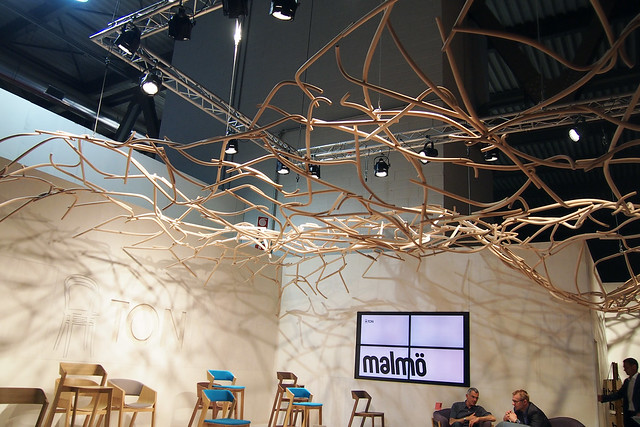
The ceiling design is a modern take on gothic architecture.
BITUING MARIKIT - Nicanor Abelardo (bedroom)

UGOY NG DUYAN - Lea Salonga (nursery room)


BONGGA KA 'DAY - Hotdog (vanity room)


KALEIDOSCOPE WORLD - Francis M. (learning center)

KATAWAN - Hagibis (spa)

AWITIN MO AT ISASAYAW KO - VST & Company

The LED screens are worth millions!
AWIT NG BARKADA - Apo Hiking Society (
barkada room)

The lights are controlled by an app. You can change it to whatever colour you want!
UMAGANG KAY GANDA - Tillie Romero & Ray-An Fuentes (beach front room)


This one really made me miss the island life.
HARI NG SABLAY - Sugarfree (teenage boy's room)

A hanging/suspended bed!!!
ANG HULING EL BIMBO - Eraserheads


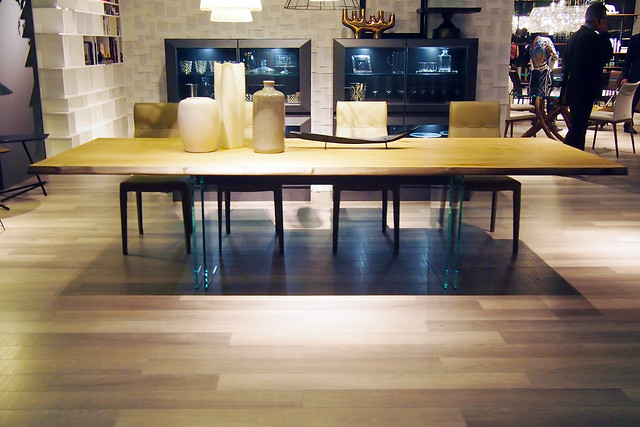
Love that they used different floor planks and added borders to the mirrored walls- it makes for a unique dance room.
HIMALA - Rivermaya (meditation room)


MR. SUAVE - Parokya ni Edgar (bachelor's pad)

A lounge that transforms into a bed right beside the kitchen? Yes please.
MY NEW TATTOO - Urbandub (coffee & wine bar)

NARDA - Kamikazee (novelty store)


❧
For decades now, PSID has been known to produce groundbreaking exhibits that become the benchmark of interior design exhibits in the academe. Sponsored by Boysen, La Europa Ceramica, Alfred Galvez Wall Art Designs and Finishes, Apo Floors, Focus Global, Inc, Larry’s Curtain, and Palmer Asia, “OPM” is carefully planned, extensively researched and masterfully executed, a trademark that all PSID exhibits have always been known for and will continue to be known for in the years to come.
Congrats to this year's graduating batch!!! I hope you guys get to drop by their exhibit in Glorietta- it'll be up for the entire month of October and entrance is FREE!
