Here are some before and afters I did yesterday for the living room...
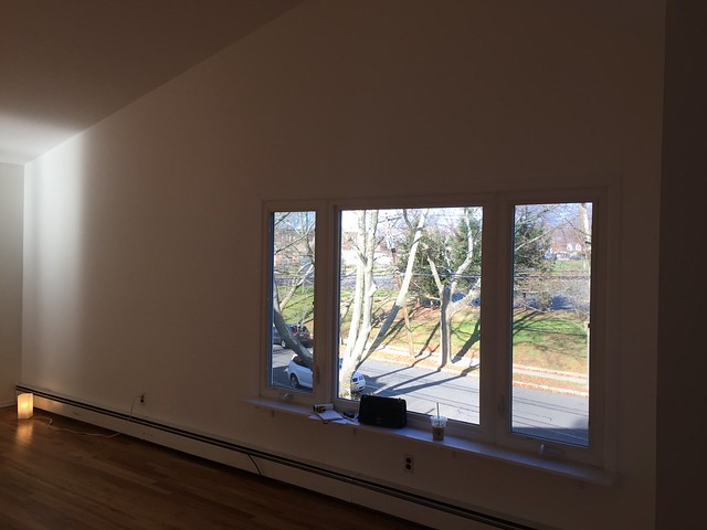
BEFORE:
AFTER:
Adding a window to make the facade more symmetrical and to let more light in
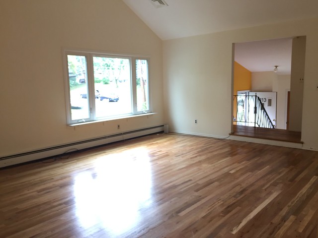
BEFORE:
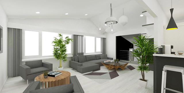
AFTER:
Hard wood flooring in white pickled finish.
BEFORE:
AFTER:
Kitchen and dining are currently divided by a wall. Opening it up and adding a breakfast nook/counter!
2nd FLOOR PLAN
Not shown:
1st Floor
(Guest room 2, Office 2 & Toilet/Bath 2)
Deck & garden/exterior
❧
Wanted something very airy, bright and open for our home so we opted for a semi-open plan. Added a breakfast nook that peeked through the kitchen a bit so diners could still interact with whoever occupied the living area. We kept in mind that family would come over most of the time and while we can't have more than 6 in the dining area, we could create a layout that allowed conversation even when people were situated in different parts of the communal areas.
I created an all-white canvas through walls and flooring since the house isn't too big and white really opens up any space. Black walls by the entrance and the exterior/sidings (not shown) create the perfect contrast. We're not big fans of color so an achromatic scheme through the architectural elements and furniture was a natural choice. Plants and lighting provide the perfect warmth and cozy touch to an otherwise stark space.
Hope you liked this sneak peek!
❤


